Flutter 3.10: The Most Important Updates You Need to Know
Flutter 3.10, the latest version of the popular cross-platform development framework, was released in May 2023. This major update includes a number of new features and improvements that make it even more powerful and versatile.
Here are some of the most important updates to Flutter 3.10,
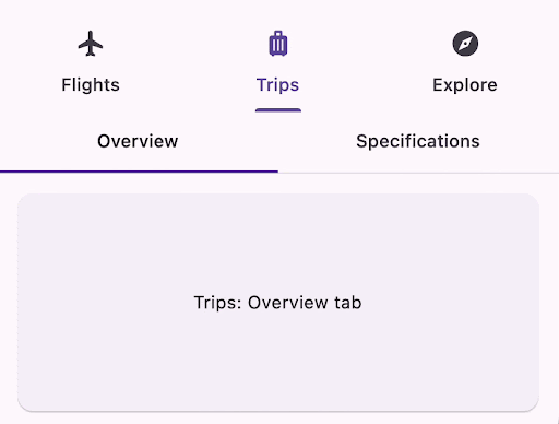
Material 3: A New Era of Design
Material 3 is the latest version of Google's design language. It's a major update that introduces a new color palette, typography, and component library. Material 3 is designed to be more expressive, customizable, and accessible than ever before.
One of the most important features of Material 3 is the new color palette. The color palette is wider and more vibrant than the color palette of Material 2. It's also more customizable, allowing you to create color schemes that reflect your brand or personal style.
To use the M3 version of the Material library, set the value of useMaterial3 to true in your MaterialApp theme. The flutter create command automatically adds this value to your theme when creating a new app.
To see the new changes included in the new version of Material we can use the demo app.
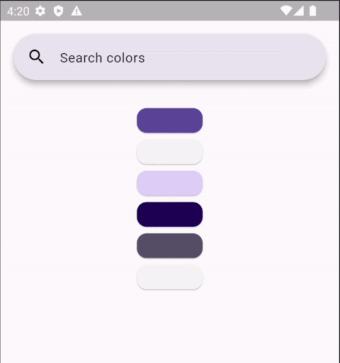
A Colorful New Way to Design: ColorScheme.fromImageProvider()
No matter how you choose to create your color scheme, you can be sure that it will look good and be accessible. Material 3 is designed to be used by people of all abilities, so you can rest assured that your app will be easy to use for everyone.
Here's how to create a custom color scheme for your Material 3 app:
Choose a "seed" color. This is the color that will be used as the base for your color scheme.
Use the Material 3 color tool to generate a custom color scheme from your seed color.
Preview your color scheme in the Material 3 demo.
Make any necessary adjustments to your color scheme.
Add your custom color scheme to your app.
Creating a custom color scheme for your Material 3 app is easy and fun. With a little bit of effort, you can create a color scheme that is both beautiful and accessible.
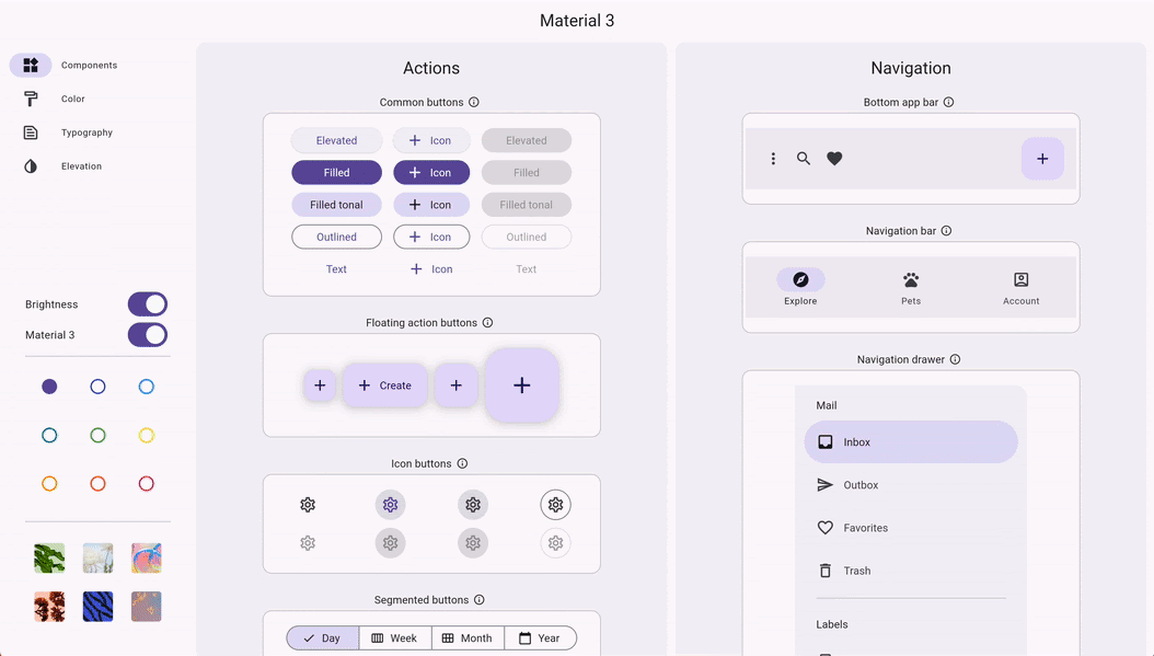
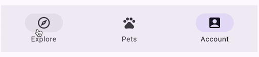
NavigationBar: The New Standard for BottomNavigationBar
The NavigationBar widget is the new standard for BottomNavigationBar in Material 3. It offers a number of improvements over the previous version, including:
New colors: The NavigationBar uses a new color palette that is more vibrant and expressive.
New highlighting: The NavigationBar highlights the selected tab with a new, more subtle effect.
New elevation: The NavigationBar has a new elevation that makes it feel more grounded and tactile.
To override the default appearance of the NavigationBar widget, you can use the NavigationBarTheme widget. This widget allows you to customize the colors, highlighting, and elevation of the NavigationBar to match your app's design.
You don't need to migrate existing apps to the NavigationBar widget, but you should use it for new apps. The NavigationBar is the future of BottomNavigationBar in Material 3, and it offers a number of improvements that will make your apps look and feel better.
Here are some additional benefits of using the NavigationBar widget:
It is more accessible than the previous version of BottomNavigationBar.
It is more customizable, allowing you to create a NavigationBar that matches your app's design.
It is more performant, making your app feel more responsive.
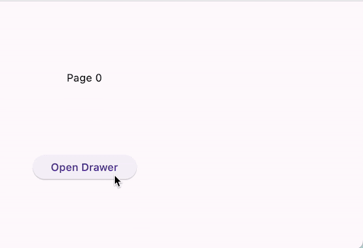
NavigationDrawer: The New Navigation Destination Selection Widget
The NavigationDrawer widget is the new navigation destination selection widget for Material 3. It is based on the Drawer widget, but it offers a number of improvements, including:
Single-selection list: The NavigationDrawer only shows a single-selection list of NavigationDestinations widgets. This makes it easier for users to select the destination they want.
Flexible content: You can include other widgets in the NavigationDrawer list, in addition to NavigationDestinations widgets. This gives you more flexibility in how you design your navigation drawer.
Scrollable: The NavigationDrawer can scroll when needed. This is helpful for apps with a lot of destinations.
To override the default appearance of the NavigationDrawer widget, you can use the NavigationDrawerTheme widget. This widget allows you to customize the colors, typography, and elevation of the NavigationDrawer to match your app's design.
Here are some additional benefits of using the NavigationDrawer widget:
It is more accessible than the previous version of Drawer.
It is more customizable, allowing you to create a NavigationDrawer that matches your app's design.demo
It is more performant, making your app feel more responsive.
SearchBar and SearchAnchor: The New Search Widgets for Material 3
The SearchBar and SearchAnchor widgets are the new search widgets for Material 3. They offer a number of improvements over the previous versions, including:
Predictive text: The SearchBar and SearchAnchor widgets now offer predictive text, which helps users find the search terms they are looking for more quickly.
Search view: The SearchBar and SearchAnchor widgets now show a search view that lists the matching responses to the user's search query. This makes it easier for users to find the information they are looking for.
Customizable design: The SearchBar and SearchAnchor widgets are now more customizable, allowing you to create a search bar that matches the design of your app.
To override the default design of the SearchBar and SearchAnchor widgets, you can use the SearchBarTheme and SearchAnchorTheme widgets. These widgets allow you to customize the colors, typography, and elevation of the search bar to match your app's design.
Here are some additional benefits of using the SearchBar and SearchAnchor widgets:
They are more accessible than the previous versions of SearchBar and SearchAnchor.
They are more customizable, allowing you to create a search bar that matches the design of your app.
They are more performant, making your app feel more responsive.
Secondary Tab Bar: The New Way to Add Tabs to Your App
Material 3 introduces a new way to add tabs to your app: the Secondary Tab Bar. The Secondary Tab Bar is a perfect way to add a second tier of tabbed content to your app, without cluttering up the main tab bar.
To use the Secondary Tab Bar, you simply need to add the TabBar.secondary property to your tab bar widget. This will make the tab bar appear in a different color and style, which will help to distinguish it from the main tab bar.
The Secondary Tab Bar is a great way to add more functionality to your app without taking up too much space. It's also a great way to organize your app's content in a way that makes sense for your users.
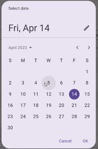
DatePicker: The New Date Picker for Material 3
The DatePicker widget has been updated for Material 3 with new colors, layout, and shape. The calendar and textfield versions of the widget have both been updated to match the new Material 3 design language.
The API for the DatePicker widget has not changed, but a new DatePickerTheme widget has been added. This widget allows you to customize the colors, typography, and elevation of the DatePicker to match the design of your app.
The updated DatePicker widget is more modern and stylish than the previous version. It is also more accessible, with larger text and buttons that are easier to tap.
If you are looking for a better way to add a date picker to your Material 3 app, then the updated DatePicker widget is the perfect choice for you.
Here are some of the benefits of using the updated DatePicker widget:
It is more modern and stylish, matching the new Material 3 design language.
It is more accessible, with larger text and buttons that are easier to tap.
It is more customizable, with the new DatePickerTheme widget.
It is still fully compatible with the previous version of the DatePicker widget, so you can easily migrate your existing apps to the new version.
BottomSheet: The New Bottom Sheet for Material 3
The BottomSheet widget has been updated for Material 3 with new colors, shape, and an optional drag handle. The API for the BottomSheet widget has not changed, but the new drag handle feature allows you to make the BottomSheet more interactive and user-friendly.
To add a drag handle to your BottomSheet, simply set the showDragHandle property to true. This will add a small handle to the bottom of the BottomSheet that users can drag to move the BottomSheet around.
The drag handle is a great way to make your BottomSheet more interactive and user-friendly. It allows users to easily move the BottomSheet around to see different content. It also makes it easier for users to close the BottomSheet when they are finished with it.

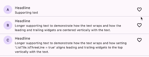
ListTile: The New ListTile for Material 3
The ListTile widget has been updated for Material 3 with new positioning and spacing. The API for the ListTile widget has not changed, but the new positioning and spacing make the ListTile more modern and stylish.
The content padding has been increased, which gives the ListTile a more spacious feel. The leading and trailing widget alignment has been changed to be centered, which makes the ListTile more symmetrical. The minimum leading width has been increased, which gives the leading widget more space to breathe. And the vertical spacing between the ListTile and its children has been increased, which gives the ListTile a more balanced look.
The updated ListTile is more modern and stylish than the previous version. It is also more accessible, with larger text and buttons that are easier to tap.
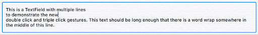
TextField Updates for Material 3
The TextField widget has been updated for Material 3 to support native gestures. This means that you can now double click or triple click on a TextField with a mouse to perform the same actions as double tapping or triple tapping on a touch device.
By default, the TextField and CupertinoTextField widgets use these features. However, you can disable them by setting the enableNativeGestures property to false.
Triple Click/Tap Gestures in TextFields:
Triple click gesture
Selects an entire paragraph block at the clicked position.
Selects a line block at the clicked position (Linux).
Selects all text within a single-line TextField.
Triple tap gesture
Within a multi-line TextField, a triple tap gesture triggers the following behaviors:
Selects a paragraph block at the clicked position.
Selects all text within a single-line TextField.
Triple click and drag gesture
When coupled with dragging, a triple click gesture initiates the following actions:
Extends the selection within paragraph blocks (Android/Fuchsia/iOS/macOS/Windows).
Extends the selection within line blocks (Linux).
These gestures enhance the text selection capabilities of TextFields across different platforms, offering a convenient and intuitive way to interact with text content.

Comments
Post a Comment